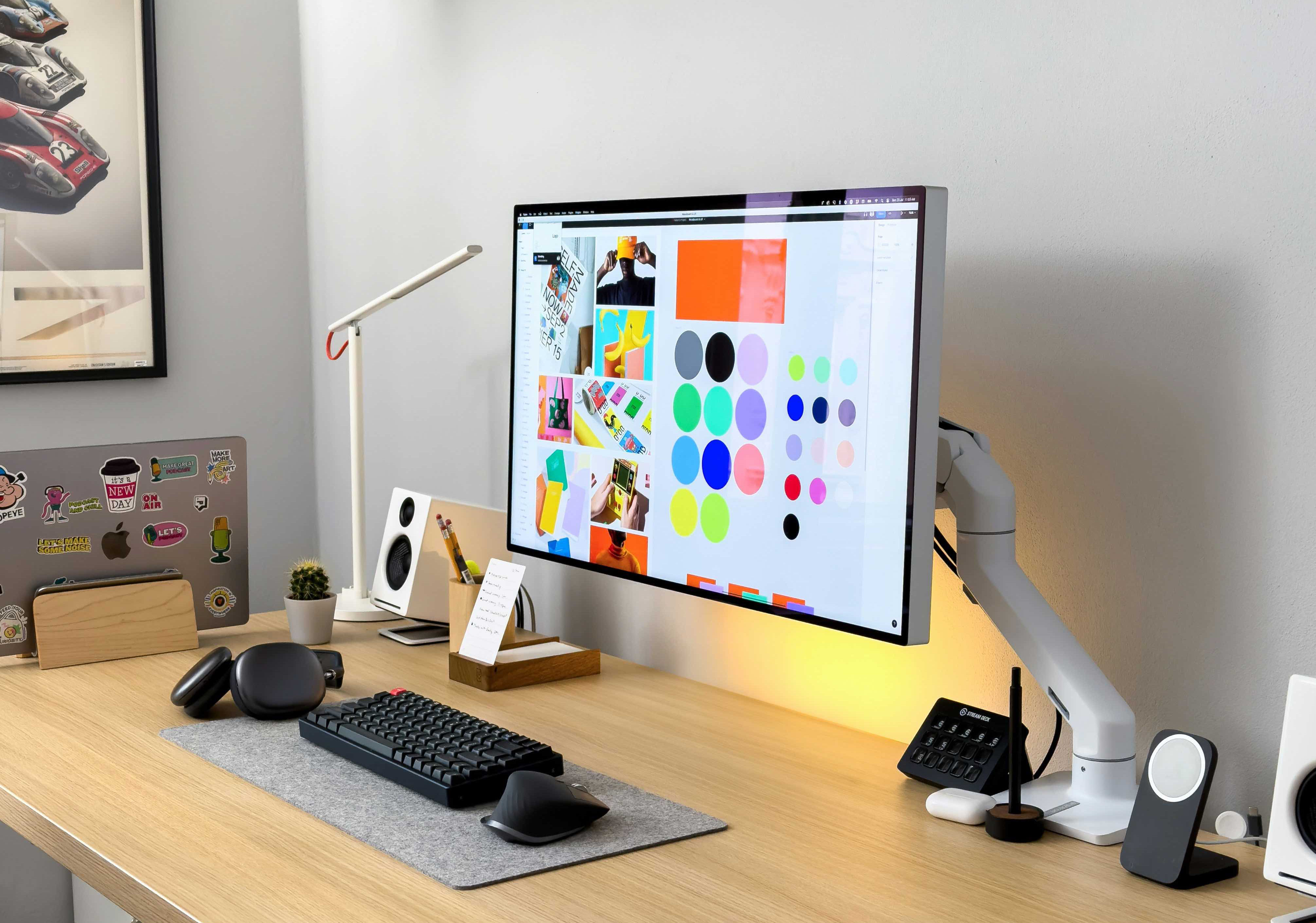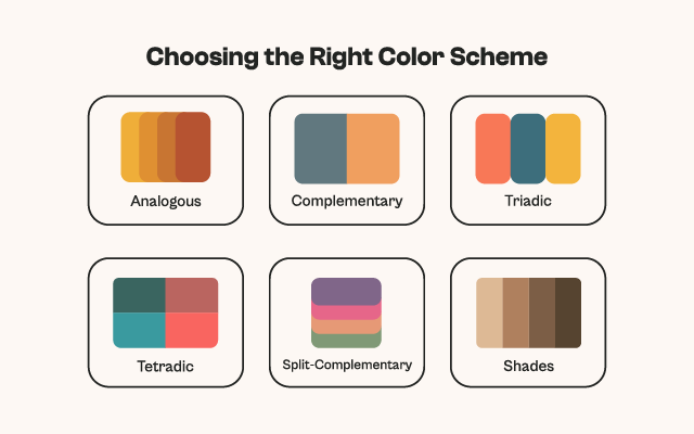
Color is one of the most powerful tools in design. It creates mood, builds structure, and guides the user’s eye. With Vibra, you can explore six different color harmonies from a single base color, helping you build a palette that’s not only functional but also emotionally resonant.
Let’s walk through each of the six systems Vibra uses, so you can understand their strengths and when to use them.
🎯 Complementary: Strong contrast, bold statements
Complementary colors sit directly across from each other on the color wheel. Think of blue and orange or red and green. These combinations create maximum contrast and visual energy, which makes them perfect for calls-to-action or elements that need to stand out.
However, too much complementary contrast can feel jarring. It’s usually best to let one color dominate while the other plays a supporting role.
Best used in: promotional banners, CTA buttons, key sections that require attention.
🌿 Analogous: Smooth, harmonious, and natural
Analogous palettes are built using colors that are next to each other on the wheel. These combinations are more subtle and feel naturally balanced, as they’re often found in nature, like a cluster of warm oranges or cool blues and teals.
This system is ideal when you want visual flow or a sense of calm. It works beautifully for background gradients, UI states, or branding that prioritizes softness and accessibility.
Best used in: lifestyle brands, app UIs, nature-inspired themes.
🔺 Triadic: Balanced and vibrant
Triadic palettes are created by choosing three colors that are evenly spaced around the color wheel. This harmony gives you contrast and variety without being as intense as complementary combinations.
Triadic systems often feel energetic but still balanced. Use one color as dominant and let the other two serve as accents. It’s especially effective in brands targeting younger audiences or tech-savvy users.
Best used in: startup branding, product packaging, creative interfaces.
🧩 Split-Complementary: Controlled contrast with flexibility
Split-complementary palettes are similar to the complementary system, but a bit more nuanced. Instead of using the exact opposite color, you use the two colors adjacent to it. This offers contrast, but it’s easier to balance and feels less aggressive.
Designers turn to this system when they want contrast without the intensity of a direct complement. It’s ideal for editorial layouts or applications that need depth without distraction.
Best used in: creative tools, storytelling interfaces, digital magazines.
🧱 Monochromatic: Elegant simplicity
A monochromatic palette uses one hue and builds a color system through changes in brightness and saturation. This results in a cohesive, clean look with clear hierarchy and excellent readability.
It’s especially useful for minimal design, functional dashboards, or content-first platforms where consistency and clarity matter more than variety.
Best used in: UI dashboards, portfolios, clean mobile apps.
🌘 Shades: Structural depth within one hue
Shades are created by darkening a single hue. This approach is excellent for building hierarchy within a color system. You can use lighter shades for backgrounds, medium tones for content, and darker ones for interactive elements.
While monochromatic harmonies include tints, tones, and shades, the “Shades” system in Vibra focuses on depth and usability. It’s a great option for interfaces that need clear visual distinction without introducing new colors.
Best used in: dark mode UIs, admin panels, accessible design systems.
💡 Color theory meets practicality
Inside Vibra, you can explore all six of these systems in seconds. Just paste your base hex code, and you’ll get six harmonized palettes instantly. Each one is copyable with a single click, so you can build, test, and iterate quickly.
Whether you’re designing a brand, a website, or a product, these systems give you structure to guide your visual direction.
🎨 There are no strict rules—just visual rhythms
These harmonies are a great starting point, but they’re not limits. You can mix them, layer them, or even break them if the design feels right. The important thing is understanding how they work so your decisions feel intentional.
Use the complementary system for contrast, the monochrome system for clarity, and the analogous system for warmth and flow. Let shades build hierarchy, triads add energy, and split complements introduce complexity.
With Vibra, color exploration becomes part of your design rhythm.